Video editing used to be a closed room. You needed someone who knew keyframes, easing curves, and timelines just to make a logo move for two seconds. That’s not true anymore.
AI did this to photo editing first. Now it’s doing it to video too. You upload your logo, paste a prompt, and it animates, no editing software, no rendering queue, no waiting on someone else’s calendar.
Below: 20 ready-to-use logo animation video prompts across 10 brand styles, plus how to write your own once you run out of these. First, let’s get clear on what a prompt like this actually looks like.
What Is an AI Logo Animation Video Prompt?
A sentence that tells AI exactly how your still logo should move. What changes, what stays frozen, how long it takes, and what it looks like the second it’s done moving.
Example:
“A thin line traces the outline of the logo symbol, then the wordmark fades in beneath it. Clean and minimal motion. White background. Ends on the exact original logo, centered and sharp. 3 seconds, 16:9.”
One sentence, four decisions made.
<Motion + Timing + Background + Ending>
That’s what one already looks like. Writing your own from scratch is a slightly different skill, though, so here’s the actual method.
How to Write a Prompt for Image to Video
Yeah, we all already know how to prompt for an image, subject, lighting, mood, done. That skill is everywhere now. But animating that image is a different muscle, and almost nobody’s actually explained it yet.
The easiest way to remember it is “Lock, Move, Land.” That’s the mantra for writing any basic animation prompt.
| Step | What to do | As a sentence |
| Lock | What absolutely cannot change, shape, colors, type, spacing | “Preserve the uploaded logo’s exact shape, colors, and typography.” |
| Move | One motion, picked on purpose | “A thin line traces the symbol, then the wordmark fades in.” |
| Land | Where it has to end up | “Ends on the exact original logo, centered and sharp.” |
Three more things that quietly decide whether this works:
Decide duration first.
How long your logo should animate depends on the platform it’s going on. For example, a YouTube intro can breathe for 3 seconds, but a TikTok ad only gets 1.5 seconds. (We’ll get into specific durations for every platform in a few minutes.)
Decide where this is going before you decide how long it moves, otherwise your whole video can fall apart because of this one simple oversight.
Preserve logo ≠ no new elements
Writing “Preserve the logo” in prompt box, keeps your actual logo’s shape, colors, and text, untouched. But it doesn’t say anything about what else shows up around it. AI can still add sparkles, stray text, or extra elements near the logo unless you specifically rule them out.
The fix: generate once with your basic prompt, check what extra elements showed up that you didn’t ask for, then name them directly in your next prompt to rule them out.
Do NOT follow the trend
Trends are for posts, made to go viral and grab temporary audience attention. But for something like a logo, it should be purely about your brand message, usability, and tone. Nobody wants to see a wellness brand’s logo dancing around like a goofball, they’ll only relate to it if the animation feels more like a slow, gentle bloom.
With these, you’ve got everything you need to write your own. But you don’t have to, here are 20 already built.
Related: 70 Prompts to create logo with AI
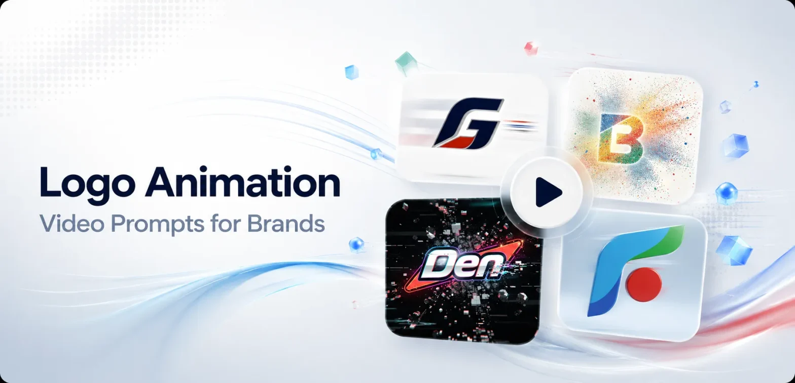
20 Logo Animation Video Prompts by Brand Style
Copy and paste whichever animation matches the feeling you want in any image to video tools.
Prompt 1: Line Draw Reveal
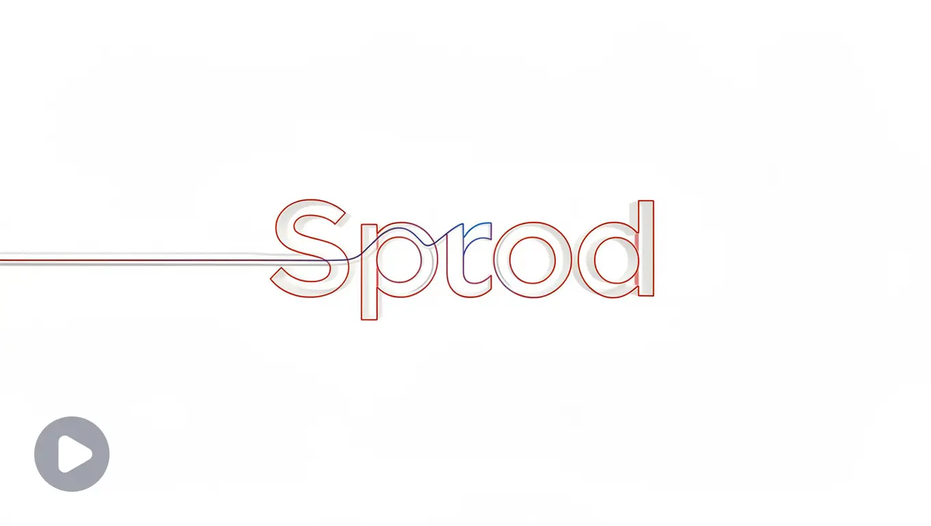
Preserve the uploaded logo’s exact shape, colors, and typography. A thin single line traces the outline of the logo symbol from start to finish, then the wordmark fades in cleanly beneath it. Calm, minimal motion. Plain white background, no extra elements. Static camera. Ends on the exact original logo, centered and sharp. 2 seconds, 16:9.
Impact: Calm and unhurried, suits brands that want to feel effortless rather than flashy.
Best for industries: SaaS, productivity tools.
Prompt 2: Soft Fade-Up
Preserve the uploaded logo’s exact shape, colors, and typography. Logo fades in from 0% to 100% opacity while subtly rising a few pixels upward, settling into its final centered position. No bounce, no overshoot, just a clean settle. Soft grey gradient background. Ends on the exact original logo, fully sharp and centered. 2 seconds, 1:1.
Impact: A quiet entrance with zero drama, good for brands that let the work speak instead.
Best for industries: Design studios, minimal brands.
Prompt 3: Slide-In Assembly
Preserve the uploaded logo’s exact shape, colors, and typography. Logo elements (symbol and wordmark) slide in separately from opposite directions and lock into place with a subtle, professional snap. No flashy effects. Clean white or light grey background. Static camera. Ends on the exact original logo, centered and fully readable. 3 seconds, 16:9.
Impact: Structured and deliberate, nothing about it feels rushed or accidental.
Best for industries: Consulting, enterprise software, finance.
Prompt 4: Light Sweep Reveal
Preserve the uploaded logo’s exact shape, colors, and typography. A soft horizontal light sweep passes once across the logo from left to right, briefly highlighting it before settling into stillness. Subdued, professional tone, no neon or saturation. Neutral corporate background. Ends on the exact original logo, sharp and centered. 3 seconds, 16:9.
Impact: Stays quiet and controlled, one single pass of light, nothing loud.
Best for industries: Law firms, B2B.
Prompt 5: Gold Dust Reveal
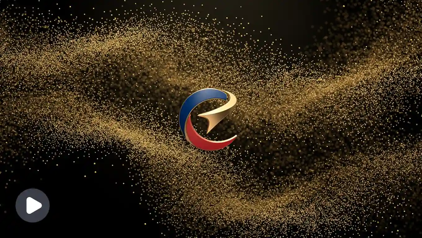
Preserve the uploaded logo’s exact shape, colors, and typography. Fine gold particles drift inward from the edges of the frame and converge to form the logo, settling into its final sharp shape. Slow, deliberate motion. Deep black background. Cinematic, high-end feel. Ends on the exact original logo, centered and crisp. 4 seconds, 16:9.
Impact: Slow and deliberate, the kind of pacing that signals expense without saying it.
Best for industries: Jewelry, high fashion, hospitality.
Prompt 6: Velvet Curtain Reveal
Preserve the uploaded logo’s exact shape, colors, and typography. A dark curtain-like fade parts from the center outward to reveal the logo underneath, evoking a premium unveiling moment. Slow and elegant pacing. Rich black or deep maroon background. Ends on the exact original logo, fully visible and centered. 3 seconds, 16:9.
Impact: Feels like an unveiling, suits brands built around a sense of occasion.
Best for industries: Luxury hotels, private clubs.
Prompt 7: Particle Assembly
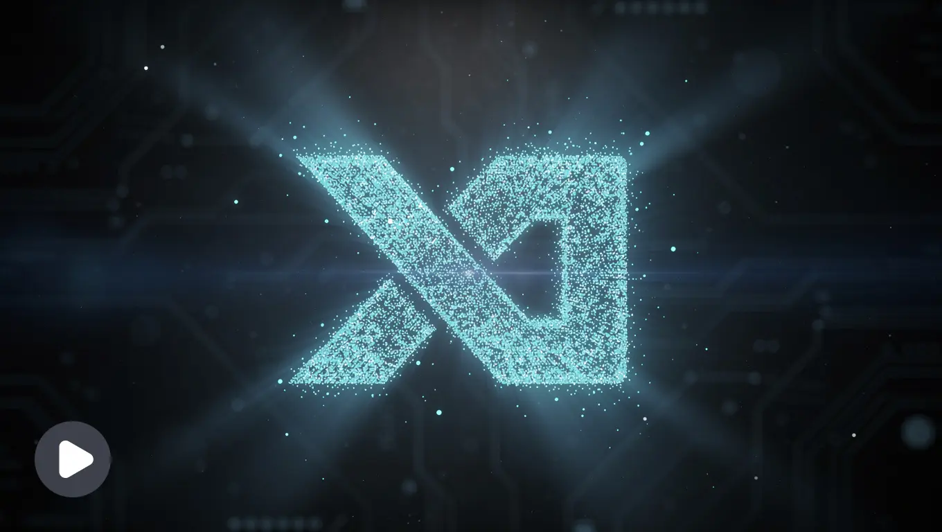
Preserve the uploaded logo’s exact shape, colors, and typography. Logo appears to assemble from small glowing particles or pixels that converge into its final form, with a faint blue or cyan glow during the transition. Futuristic, precise motion. Dark tech-themed background. Ends on the exact original logo, sharp and centered, glow fading to nothing. 3 seconds, 16:9.
Impact: Looks engineered rather than decorated, fits brands built on precision.
Best for industries: AI products, dev tools.
Prompt 8: Circuit Pulse
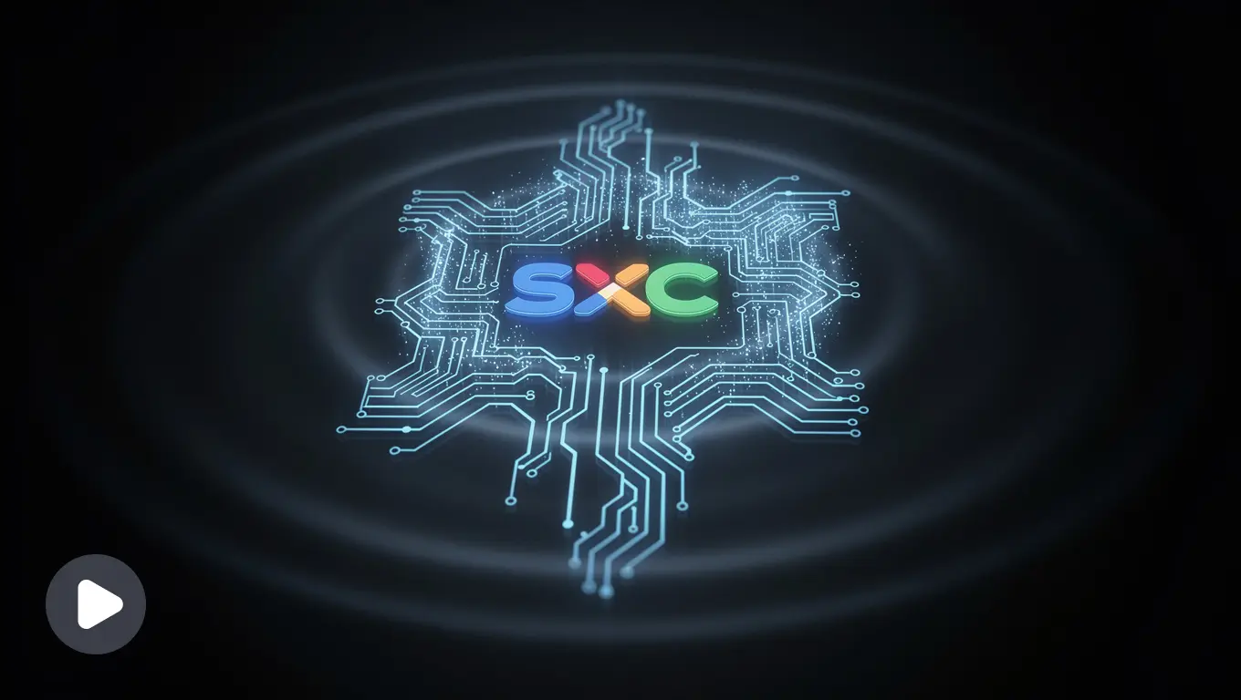
Preserve the uploaded logo’s exact shape, colors, and typography. A thin glowing line traces a circuit-like path before snapping into the exact outline of the logo, with a brief pulse of light across the symbol. Sharp, technical motion. Dark background with subtle grid texture. Ends on the exact original logo, fully resolved and centered. 3 seconds, 16:9.
Impact: Sharp and mechanical, reads as technical rather than artistic.
Best for industries: Hardware, cybersecurity, infrastructure.
Prompt 9: Impact Stamp
Preserve the uploaded logo’s exact shape, colors, and typography. Logo slams into frame with a quick impact effect, brief screen shake, and a flash of light on contact. High energy, fast motion. Dark background with subtle motion streaks. Ends on the exact original logo, steady, centered, and sharp. 2 seconds, 16:9.
Impact: Hits hard and fast, suits brands that run on adrenaline.
Best for industries: Gaming, esports.
Prompt 10: Energy Charge-Up
Preserve the uploaded logo’s exact shape, colors, and typography. Logo builds up with a glowing energy effect that intensifies and then releases in a quick flash, revealing the sharp final logo. Bold, high-contrast motion. Dark background with electric color accents matching the logo’s palette. Ends on the exact original logo, centered and crisp. 3 seconds, 16:9.
Impact: Builds tension before releasing it, good for brands selling hype.
Best for industries: Streaming brands, competitive gaming.
Prompt 11: Steam Dissolve Reveal
Preserve the uploaded logo’s exact shape, colors, and typography. Soft steam or warmth-like wisps drift upward and gently dissolve to reveal the logo underneath. Cozy, inviting pacing. Warm cream or beige background. Ends on the exact original logo, centered and fully clear. 3 seconds, 1:1.
Impact: Warm and unhurried, feels handmade rather than manufactured.
Best for industries: Coffee shops, bakeries.
Prompt 12: Ink Trace Reveal
Preserve the uploaded logo’s exact shape, colors, and typography. Logo appears as if being drawn by an invisible pen, ink tracing the outline naturally before the full mark settles into place. Organic, handcrafted feel. Soft cream paper-textured background. Ends on the exact original logo, sharp and centered. 3 seconds, 1:1.
Impact: Looks personally drawn, suits brands that lean into craft over scale.
Best for industries: Small-batch food, artisan goods.
Prompt 13: Bloom Reveal
Preserve the uploaded logo’s exact shape, colors, and typography. Logo gently grows into frame as if blooming, starting small and softly expanding to full size with a calm, breathing-like easing curve. Soft, natural motion. Pale sage or cream background. Ends on the exact original logo, centered and fully settled. 3 seconds, 1:1.
Impact: Grows rather than appears, suits brands built around care and patience.
Best for industries: Skincare, yoga studios.
Prompt 14: Light Ripple
Preserve the uploaded logo’s exact shape, colors, and typography. A soft ripple of light moves outward from the center of the logo, like a calm water ripple, before settling into stillness. Gentle, slow pacing. Soft pastel background. Ends on the exact original logo, sharp and centered. 3 seconds, 1:1.
Impact: Gentle and contained, never demands attention, just offers it.
Best for industries: Mental health apps, wellness brands.
Prompt 15: Color Burst Reveal
Preserve the uploaded logo’s exact shape, colors, and typography. Logo appears with a brief, playful burst of color particles matching its own palette, scattering outward before the sharp logo settles in the center. Bold and expressive motion. Clean light background. Ends on the exact original logo, centered and crisp. 3 seconds, 1:1.
Impact: Playful without being chaotic, suits brands that want personality on display.
Best for industries: Design studios, marketing agencies.
Prompt 16: Glitch-to-Clean Reveal
Preserve the uploaded logo’s exact shape, colors, and typography. Logo briefly glitches with quick fragmented motion before snapping cleanly into its final, sharp form. Energetic, modern motion. Dark or bold-colored background matching brand palette. Ends on the exact original logo, fully resolved, centered, and stable. 2 seconds, 16:9.
Impact: Starts rough, ends sharp, suits brands with an edge that still wants to look polished.
Best for industries: Creative agencies, music brands.
Prompt 17: Loading Dot Morph
Preserve the uploaded logo’s exact shape, colors, and typography. A small pulsing dot expands and morphs smoothly into the full logo shape, like a loading indicator completing. Friendly, quick motion. Clean white or brand-colored background. Ends on the exact original logo, centered and sharp. 2 seconds, 1:1.
Impact: Feels like something completing, not arriving, suits lightweight digital products.
Best for industries: Mobile apps, early-stage products.
Prompt 18: Bounce Pop-In
Preserve the uploaded logo’s exact shape, colors, and typography. Logo pops into frame with a quick, slightly bouncy scale-up motion, settling immediately into its final size with no overshoot wobble. Energetic but clean. Simple solid color background. Ends on the exact original logo, centered, sharp, and steady. 2 seconds, 1:1.
Impact: Friendly and quick, has energy without losing control.
Best for industries: Startups, consumer apps.
Prompt 19: Soundwave Reveal
Preserve the uploaded logo’s exact shape, colors, and typography. Soft audio waveform lines pulse briefly across the frame before condensing and forming the shape of the logo. Friendly, rhythmic motion. Dark or warm-toned background. Ends on the exact original logo, centered and fully clear. 3 seconds, 16:9.
Impact: Built around rhythm, makes sense for anything tied to sound.
Best for industries: Podcasts, music brands.
Prompt 20: Drop-In Settle
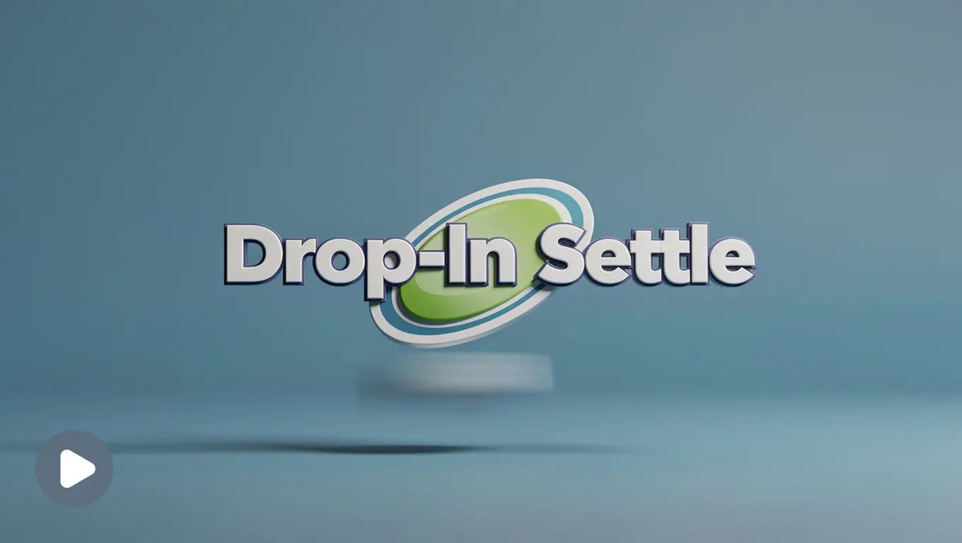
Preserve the uploaded logo’s exact shape, colors, and typography. Logo drops into frame from slightly above with a soft, weighted landing motion and a subtle bounce, like settling into place. Casual, confident pacing. Clean solid background matching brand color. Ends on the exact original logo, centered and stable. 2 seconds, 16:9.
Impact: Casual and settled, fits personality-driven brands rather than corporate ones.
Best for industries: Creators, YouTube channels.
Tweaking Prompts by Platform
Same prompt, different platform, different math.
| Platform | Duration | Aspect Ratio | Why |
| YouTube intro | 2–3 seconds | 16:9 | Viewers already clicked, they can wait a beat |
| Instagram Reels | 1–2 seconds | 9:16 | Land it fast or lose the scroll |
| TikTok | 1–2 seconds | 9:16 | Same math as Reels, lean bolder, that’s the platform’s native energy |
| Website loader | 1–2 seconds | 1:1 or 16:9 | Loop-friendly motion, since it might play more than once |
| Presentations | 3–4 seconds | 16:9 | Calmer pacing, this is setting a tone, not grabbing attention |
| WhatsApp Status / Stories | 2–3 seconds | 9:16 | Simple enough to read at phone size |
Adjust the duration and aspect ratio lines, leave the motion description alone.
Prompt picked, duration adjusted, now let’s actually turn it into a finished video.
How to use these prompts
Step 1: Open lightxeditor.com or the iOS or Android app. Go to the AI Image-to-Video tool.
Step 2: Upload your logo, clean PNG, JPG, or webP. Don’t have a logo ? Create here.
Step 3: Paste a prompt from above, or pick a preset.
Step 4: Generate. Seconds, not hours.
Step 5: Download in the format you need and drop it straight into your intro, Reel, or site.
Even with all this, the first attempt doesn’t always land. Here’s what usually goes wrong and the one-line fix for each.
Common Mistakes and How to Fix Them
| Problem | Fix |
| Logo looks slightly off (wrong color, distorted shape) | Lead with “preserve exact shape, colors, and typography” |
| Animation feels busy | One motion only, cut every second effect from the sentence |
| Final frame looks unfinished | Add a clear Land line: “ends on the exact original logo, sharp and centered” |
| Doesn’t fit the platform | Fix duration and aspect ratio before generating, not after |
| Tone mismatch (playful on a serious brand, or the reverse) | Match the brand style category to your actual brand |
| Background fights the logo colors | Default to plain white or black if nothing else contrasts cleanly |
That covers everyone who came here already sure they wanted to animate something. For the few who landed here still deciding, here’s the other side of it.
Why animate (but when not)
A few honest reasons, the obvious ones and the slightly stranger ones, for anyone still deciding instead of already prompting.
Why bother:
- Drops bounce rate
Because the loading screen is static, the user can get confused if the screen is hanged or something. Loading animation makes the loading bearable for user. Dynamic loading animations reduce perceived waiting time compared to static screens. - Builds memory for free (and it’s underrated)
7+ exposures to a brand can drive 60% more recall, and that’s basically what a logo animation gives you for free, every single time it plays. - If logo is weak, animation can make up for it
Perhaps you created a logo many years ago and it’s a little irrelevant now. An animation helps the user understand the logo, for example your gaming channel name and logo can be a simple letter mark, and it doesn’t scream “this is a gaming channel” on its own. One animation, and the user instantly knows: okay, this is a gaming channel logo. - Chances of getting it viral
Netflix’s “ta-dum” and animations get used in memes (and that’s not a bad thing). Whimsical brands are more memorable than the professional, traditional way.
When not to animate:
- If your company thrives on printing
Favicons, embroidery, merch, don’t bother. Static is its job there, animation’s just a useless trick nobody in that context will ever see. - If your brand’s message is permanence, trust
Banks, law firms, anything selling permanence. Motion can undercut the one thing the brand’s actually selling, that nothing here moves fast or breaks. - At places where people are seeing it constantly
A banking app opened ten times a day doesn’t need a flashy reveal every single time. Charming once, irritating by the fifth.
Wrapping up
All in all, a logo that moves, even briefly, says more than a static one ever could. These 20 logo animation video prompts cover ten distinct animation styles. Copy and paste them, customize them however you like, or use them as a starting point to write your own.
Somewhere out there, a logo is animating itself into someone’s memory. Might as well be yours.